Friday, September 28, 2012

Pen Tool Sign Project

Pen Tool Sign Project


    The most challenging part of this assignment was the part with the WELCOME sign trying to get it straight and correctly spaced. I used what was given to me to finish the project but I did use one technique I use in Animation drawing with the anchor points, I couldn't get it correct so I had to improvise. But I did do it correctly and it does look like a replica of the sign. The easiest part was doing the light bulbs even though I had to redo it twice.

Thursday, September 27, 2012

Bellwork September 27

Bellwork September 27


Using a color scheme makes the person who is reading it ether, easy to read, to draw attention, to fit its meaning and emotion. My color scheme was to ketch an eye on what the quote was and making it bold and correct by its importance by using the main colors RGB.

Tuesday, September 25, 2012

Typography Test/Project

Typography Test/Project

“Insanity: doing the same thing over and over again and expecting different results.”
-Albert Einstein

   I chose this quote because, Albert Einstein is one of my all time hero from inventing and how he saw things, and also of its meaning to me. The meaning of this quote to me is if you do the same thing over and over again like I sometimes do trying to get a different result when it is exactly the same is something I do all the time and I find it funny for being like that. I picked the color because not only to color code the different fonts but to also show the different kind of things that would go along with it since Albert Einstein is a famous scientist he should have the main colors RGB to symbolize his quotes. I guess I find my self insane at points I have done a problem over and over and finding out that the answer was right in front of me and making me feel stupid for not noticing sooner. Albert Einstein is one of my all time hero's so his quotes mean and have a better understanding to me.

Bellwork September 25

Bellwork September 25


1.)Leading- Spacing between baseline.

2.)Kerning- The spacing of a letter and how close the letter/word it to each other.

Monday, September 24, 2012

Glyph Monster

Glyph Monster
Made by: Britain Thomas


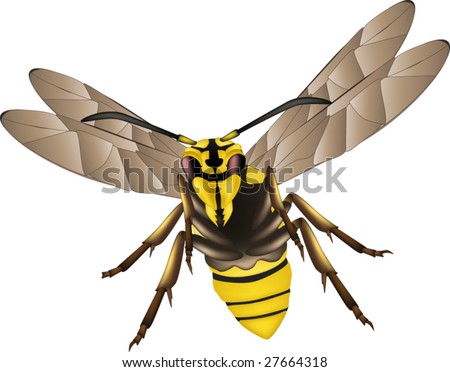
On my Glyph Monster I chose a wasp and I struggled the hardest with the wings and legs, because of the angle it was very hard to piece it together correctly. All the shapes and tools used in the photo are all Glyphs/Letters and was used on Adobe Illustrator.

Image:
http://image.shutterstock.com/display_pic_with_logo/165778/165778,1238488771,2/stock-vector-wasp-27664318.jpg

Wednesday, September 19, 2012

Bellwork September 19

Bellwork September 19


1.)Line
2.)Shape
3.)Form
4.)Color
5.)Space
6.)Texture
7.)Style

Monday, September 17, 2012

Bellwork September 17

Bellwork September 17


When picking what type to use it must be appropriate to what you are typing, business letter is being formal, party is decorative, also it is important you can read the text so you can know what it is saying.